Table of Contents
To build the best practices in tableau dashboard to get the maximum number of insights, there are some strategies that one needs to follow. Before you look for Microsoft Power BI consulting services, it would be better to gather some basic knowledge about the Tableau dashboard design.
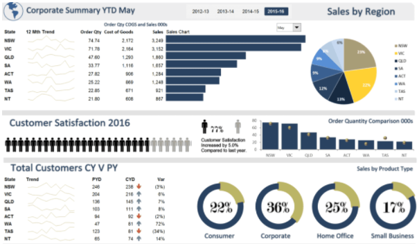
If you have to meet your customers’ requirements, we, the developers of Tableau development USA, at Techcronus are here to help you with some dashboard designing tips and tricks. Without further delay, let’s get started.
Looking To Hire Tableau Developer?
Effective dashboard layout
Aim for better performance
Use suitable charts that match your goals
| Charts | Purposes served |
|---|---|
| Bar charts | Compares numbers |
| Stacked bars | Presents categorical comparisons |
| Line charts | Shows the trends that have changed with time |
| Scatter plots | To depict outliners |
Have an idea of colour types and the purposes they serve
When you work with data, primarily while representing it, tableau best practices look at the values of the data and likewise apply color to it. In Tableau, these are the colors used:
- Gradient colors – to depict scale.
- Divergent colors – to show a profit.
- Categorical colours – to categorize items (different colours are used for another category).
When choosing the colour, consistency is one thing that should be rightly maintained. The colour that you choose as a default one should be kept the same for all pages. For changing colours, click on the ‘colour’ option followed by ‘edit.’
Reduce dashboard objects to maximize actionable insights
When the information can be conveyed, put everything in one worksheet. Let us take an example here. If you have more than one category page, avoid displaying it separately on separate bar charts. Instead, use different colours, shapes and sizes in the worksheet to show them from other dimensions. Your goal should be to minimize the confusion of the users and make the presentation as clear to them as possible.
Three types of navigation can be used in Tableau – select, hover and menu. In select, the bar chart can be clicked. On the other hand, in hover, the data bounces back when overused. Again, the case of menu navigation takes the user to a completely separate worksheet.


